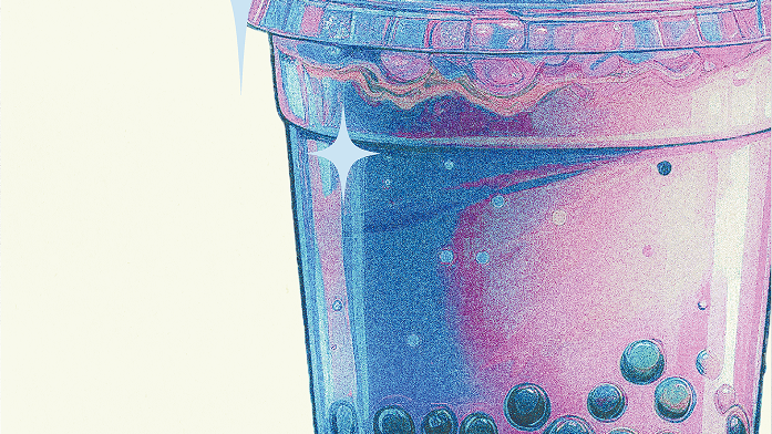
Cloud Boba is a unique take on the café experience with a goal to create
an environment where people want to come in and not just grab their boba but
get their boba and come and stay awhile because they are just that comfortable
with this environment and experience created with the use of soft colors comfortable
and easy to read typography.
an environment where people want to come in and not just grab their boba but
get their boba and come and stay awhile because they are just that comfortable
with this environment and experience created with the use of soft colors comfortable
and easy to read typography.


The logo of cloud boba is meant be a literal symbol representing the cloud and the boba and to be soft an comforting exactly as the brand should be. The challenge was making the brand not just look but feel comfortable which i solved by using light and soft colors that are easy on the eyes soft textures and easy to read typefaces.